Sunday, 29 December 2013

Radio Logo Evaluation: Buzz

Buzz:
I think Buzz represents pop music and the pop genre in general. I chose this genre for Buzz because pop music is known to be very active and upbeat, and the name buzz sounds very active and energetic. So i wanted the connection of upbeat, active and youthful tunes to be shown in the name of the station. Also this type of music is made by DJ's and on computers; in short they are often made electronically on software's. Also buzz sounds like a word to describe electricity; as in electric buzz. To show more of the energetic side of the station.

The target audience for my station would young people around the ages of 18 or older. I chose this age group as my target audience because a lot of people in that age range often go to night clubs where a lot of music in the pop genre is played so people can dance to the music. Also a lot of young people at the ages of 18-25 are very active and energetic, as young people are often thought as. This would be the reason why our music would be upbeat, so that it can seem youthful and active to the listeners.

To aim to my target audience I made the logo eye catching with bright colours to grab attention of the target audience I'm aiming for. For this particular logo the colours I used were: blue with a yellow glow. The bright colours were added to look eye catching and to be appealing. The choose of colours were used to reflect upon the lively and active nature of the station and the music they broadcast. Given how the genre of of choice is pop music, i felt that communicating the energetic feeling of the station was important to gain the attention of the audience for this type of music. I also added the lighting strike in the logo so the image can show that the radio station is very energetic and active, which will help reflect on the upbeat tone of pop music being broadcasted.

I think the main competitor against my radio station would be Capital radio. I say they would be the main competitor against my station because Capital plays pop music as its main genre of music that the station plays on a daily basis; and i as I said before pop music would be the genre of choice for this particular station.With that said Capital uses the same genre of music in order to aim to the same young target audience that Buzz will try to aim to. However my station will stand out by playing older pop songs as well as the new ones, rather than just being limited to only the latest hits.

For this logo I wanted to create a look that was eye catching and a logo that would show our target audience what genre of music our station plays which is: upbeat music, currant chart music and big club anthems. This logo would also appeal to a young audience a round the ages of 18 to 25 who would be the age group would enjoy listening to the music this station will broadcast, so it would appeal to that age group. 

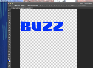
First of all I started to find a suitable font from Dafont.com. I looked for different style for fonts that were: trendy, pop style font. I decided to use the font i used for my previous logo which was called Buzz saw. I decided to use the same font in this logo, so I could make sure the connection between all the logos as clear. After I imported the font on to Photoshop I then typed Buzz onto a blank photoshop document, coloured the Buzz word in blue; I then messed around with the size thickness of the word itself changing it until I had at the right size. After I've finished with the word I moved on the rest of the logo. 

I made a lighting bolt shape with the customs shapes tool on Photoshop. I made the size and width smaller and wider in order to match up with the buzz word I just created, I linked the two later shapes together as if the bolt was striking the Z in buzz. This being done in order to show how lively the station is, as well as the music that's being played at the station.


After i did this i then added a thick line under the logo in order to make the logo look neater. I made this using the rectangle in the custom shapes selection on Photoshop and adjusted the size, width and length until the logo look right. After i did that i coloured the line blue to match with the logo.


I then added an outer glow to make the logo eye catching.  This was the same reason I added the outer glow around the lighting strike. I also did that to show the club style with bright lights and colours being present, as shown with the bright colours I used which makes the logo stand out and grab the eye of our target audience.


Overall I'm very pleased with how the logo came out after drawing the design on paper. I feel it came out looking very well when compared to the design i drew for it. Since starting to create the logo using Photoshop I've added extra features to the design. The main new feature I've added to the design is the outer glow around the logo itself. the reason for adding the glow helped me give the logo of being a club type logo and helped make the logo itself more eye catching to look at. In short this helped me achieved my desired effect for my logo.

When i asked my audience for feedback on the logo they said it fits well with the pop genre. They said they liked the glows around the brightly coloured logo, because it makes the logo stand out very well and is very eye catching. Also they said that it reminds them of the bright lights shown at clubs and discos. Overall the audience did agree that this logo did fit well for the genre.

When i was creating my logos on Photoshop i have developed some of my Photoshop skills. First of all I've developed some of editing skills on Photoshop with tools like the lasso and the magic wand making of my work look neater and in proportions. Also I've improved using layer filters in terms of changing colours, brightness, outer glows etc. Not only that but I've developed some of my skills of identifying genres for the station options i was given, and to create and develop ideas solely based on those station names and what I could figure out from the names i was given for the stations. Such as genre, style of music etc.

This logo compares to the other two I've created in two major ways: The first feature is the font which was used, and the second design feature is the design that each logo has. The design and look is used by all three logos, which includes the name of the radio station, and a shape representing the name; such as Buzz having a electric bolt; because buzz can be related to electricity. While other examples include Lock having a key at the end of the logo.I've also kept the font of each of the three logos the same. This was so it can be clear that all the logos are connect with each other as they are meant to be.

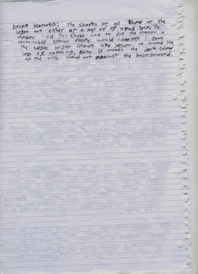
If i was to add anything new to the Buzz logo in order to improve it, i would've added a background, to be exact i would've chosen a dark coloured back ground like black. The reason i would add this to my logo is so the bright colours and glow around the logo and the lighting bolt could stand out further against the dark background colours. Because at times the edge of the logo's outer glow looks like its blending into the background when i put the logo onto a blank document. This would be the same improvement I would add to my other two logos.


Tuesday, 17 December 2013

Radio Logo Evaluation: Pulse


Radio Logo Evaluation:

Pulse:
I think Pulse represents genres like techno and dub step; this would be music performed by artist like Deadmau5 and Pendulum as two examples.  I chose this name for the station of that genre, because a pulse line are commonly used in music videos for techno songs with the line moving up and down the beat of the tune being played; Calvin Harris and Deadmau5 both use these pulse lines a lot in their videos. In short I remembered that image of pulse lines used in dub step, and when I saw the name pulse in our choices of station names. I went straight forward using this as an idea for the station. As that image is commonly used to represent sound.

My target audience for this radio station is younger people around the ages of 18-25 years. The reason I chose this demographic is because the people in that age group usually go out clubbing on a night out with their friends, and techno music is usually played at nightclubs for people to dance with. To appeal to that target audience I made the logo for this station eye catching. I did this by giving it bright colours; the colour i chose was bright green.  I also added the outer glow around the logo itself so it can be eye catching and stand out when on a poster, to grab attention. Also I did this so it can link to the club like feeling with the bright lights and colours; similar to the multicolour lights they use. This will also help to show the lively, active and youthful personality of the station, as seen in its bright and vibrant design. 

I think the main competitor against Pulse would stations like Radio 1 on weekend nights. I say this because Radio 1 and other stations play similar music during that time of day during the weekend on Saturday nights, that music being: club music, dub step, techno music etc. Not to mention that stations like these and others often get famous DJ’s to remix the songs that the station plays.  Our station is trying to have a similar audience of people who enjoy and have fun listen to this sort of music on the weekend with their mates.

When creating this logo on Photoshop I wanted to create to something simple and yet eye catching and appealing. I did this by coming up with a simple and yet creative concept with the Pulse logo and having the pulse line dropping down from the edge of the word pulse.  This would give a good understanding of what genre of music the station would be playing, which is techno music. This way it would appeal to the 18-25 year old target audience who enjoy that type of music and have a good time listening to it. I then added the bright colours and the outer glow so it’ll be eye catching and the target audience could draw the connection to club music, by having the bright lights and colours.

First of all I started to find a suitable font from Dafont.com. I looked for different style for fonts that were: trendy, techno, clubby etc. In the end I found a font called Buzz saw, which suited the club style very well; I later used this font in the two other logos I was making alongside this one. I did that so I could show that all the logos were connected with each other. After I imported the font on to Photoshop I then typed Pulse onto a blank document, and coloured the Pulse word in bright green; I then messed around with the size thickness of the word itself changing it until I had at the right size I wanted it to be.
After I’ve finished with the word I moved on the rest of the logo. I took an image of a pulse line from Google images and brought it on to Photoshop. After that I made the size and width smaller and wider to match up with the pulse word I just typed, i linked the two shapes together and changed them into having the same bright green colour the word pulse had.
I made it bright green in order to make the logo eye catching and to stand out from the background. This was the same reason i added the outer glow around the pulse line, added a inner glow for the rest of the logo. I also did that to show the club style with bright lights and colours being present, as shown with the bright colours i used. This style also helps to link the station with other styles of techno like House music. I then added a thick line underneath the logo in order to make the logo look neat. I made this using a rectangle in the custom shapes selection on Photoshop and i then adjusted the size, width and length until the logo look right.


I'm very pleased with how the logo came out after drawing the design for it. I'm glad that the look of a pulse line dropping of from the pulse word. I feel it came out looking very well when compared to the design i drew up for it. Since starting to create it on Photoshop I've added extra features to the design. The main new feature I've added to the design is the outer glow around the logo itself. The reason for adding the glow helped me give the logo of being a club type look and helped make the logo more eye catching to look at. In short i have achived the desired effect for my logo.

When i asked my audience for feedback on the logo they said it fits well with the club and techno genre. They said they liked the glows around the brightly coloured logo itself because it makes the logo stand out and is very eye catching. Also they said that it reminds them of the bright lights shown at clubs and discos. In short the audience did agree that this logo did fit well for the genre.

During these lessons when i was creating my logos on Photoshop i have developed some of my Photoshop skills. First of all I've developed some of editing skills on Photoshop with tools like the lasso and the magic wand making of my work look neater. Also I've improved using layer filters in terms of changing colours, brightness, outer glows etc. Not only that I've developed some of my skills of identifying genres for the station options i was given, and to create and develop ideas solely based on those station names and what i could figure out from the names i was given for the stations. Such as genre, style of music etc.

This logo compares to the other two logos i've creatred in two major ways: The first feature is the font i used, and the second design feature is the design that the logos use. The design and look is used by all three logos, which includes the name of the radio station, and a shape representing the name; such as pulse having a pulse line, and Lock having a key at the end of the logo.I also kept the font of each of the three logos the same so it can be clear that all the logos are connect with each other as they are meant to be.

If i was to add anything new to the Pulse logo in order to improve it, i would've added a background, to be exact i would choose a dark coloured back ground like black or a dark blue. The reason i would add this to my logo is so the bright colours and glow around the logo and the pulse line could stand out further against the dark background colours. Because at times the edge of the logo's outer glow looks like its blending into the background when i put the logo onto a blank word document.


Tuesday, 3 December 2013

Radio station logo family

Radio Station Logo Family:

These logos fit together because of the simulates that can be seen between all three of them. To start of with, all three logos share the same font and yet have different colours to identify that particular station; Lock being yellow, Buzz being blue and Pulse being green. Each logo also shares a similar deign but with new additions added to overall look. The differences being the shape connecting to the ending letter at the end of the logo. For example the Buzz logo has a lightning bolt striking the logo's ending letter, while on the other hand the Lock logo has a long key sticking out the end of the K in Lock.

This helps with the branding of OW! music stations, it does this by showing that OW! is able to play and broadcast a vast amount of music in different genres. We can tell this from these logos because of the differences that can be seen with in each of the three logos. This would help OW! because playing a lot of different music if different genres may attract listeners of that certain genre, and then build up a larger target audience.

Radio Station Target audience


Ident Story Boards


These are the story boards to the ident's that i came up with when me and Gary were planning our idents. (The story board for Garry's story board are on his blog)
Micro Phone Ident:


Record Player Ident:

 Sick Person Ident:
 

Ident Role descriptions


Role descriptions:

In the microphone and record player idents I will be taking the role of directing the ident while Gary will be assisting me. I will be taking this role since I was the person in our pair that came up with these ideas for these two idents. I will be filming and help with editing the ident. We’ll both edit the footage in order to improve our editing skills and to get more use to the software’s we will be using.


In the sick person ident Gary will be the person directing while I will be assisting this time. Gary would be directing this ident since he was the person who thought up the idea of the ident, so he would have a good understanding of what would be filmed on shooting day.  I will take the position of filming and editing the ident so I will be able to improve upon those certain skills for further projects.

Tuesday, 26 November 2013

Finished logos and file formats

 
The file format i chose to save all these logos in is a JPEG file format. The reason I've chosen to save the logos in this format is so that each of the logos can be seen and uploaded on many different software's and formats like Windows, Apple etc.

TV ident work

The design features of a TV ident:


In these mind maps me and my partner in this project Gary decided to give the idents we were drafting up an upbeat and energetic personality. We did this by having a lot of the actions in our ident be fast moving (eg the record player ident) we decided to aim for a younger audience around the ages of 16 and older ages. We did this because a lot of the decisions we made for this idents would attract a younger audience. Such as: colourful images, upbeat music, energetic pace etc. Not only that but a lot of the choices we did make would perfectly suit the ident well in terms of the first ideas we came up with during planning.

Media ident's sound and music descriptions: 
(Music choices are from incompetech.com and Free play music)

Record player ident:
Sound: Record player being turned on, a voice over narration,
Music:  Either Rock or pop music. These choices would be suitable for the ident to make the clip upbeat, lively and energetic for a younger target audience. We chose this music choice so that the channel can seem lively and active for the teenage and younger viewers.
Song choices: Pilot error,  Flashing lights instrumental.
Links: https://soundcloud.com/class-dmv/pilot-error, https://soundcloud.com/class-dmv/flashing-lights-instrumental,

Micro Phone Ident:
Music: Rock, Heavy metal music. This music choice would be suitable for this ident; so it can show that the channel is lively and active for a younger audience, which would be teenagers and older. This choice of music will appeal to the younger audience because of the active, energetic and upbeat feel that these two choices have.
Song Choices: Feelin good, Pump
Links: https://soundcloud.com/class-dmv/pump, https://soundcloud.com/class-dmv/feelin-good,
Sound: Microphone feed back from microphone being plugged into an amp. Card board box lid closing.

Sick person Ident:
Sound: Fake sick (it would be made of wool) splashing onto the floor.
Music: Disgusting type music to fit with the actions happening on screen. Upbeat to seem welcoming for the viewer and to get them interested in the channel.
Song choices: New shoes,
Link: https://soundcloud.com/class-dmv/new-shoes

Props and Costumes list:
Sick person ident.


Microphone ident.
Record player ident.


The Location Description

Where will you shoot?

This applies for all our filming.
Me and Kenny will be shooting the microphone and the title the grid  in doors as  it will look better inside a building all the musical items inside and the logo will be more visible inside a building rather than outside.

The person that is going to be sick will be done outside where there is more space for him to vomit out musical things

What does it look like?

Inside the media room it has artificial light, desk, computer and chairs  but the table will be moved apart so we can have space in the middle for the instruments and other equipment that we might use

When we are doing the part when the person is sicking out musical items and the logo, it will be outside on concrete in the middle of the playground so that there is enough space so the audience can see what is going on.

Any health issues?

Make sure all bags and chairs are tucked in, also make sure all tables are moved to one side. We also make sure that there is a first aid kit present at all times when filming.

when we are outside we make sure the playground is free that no-one is on is using it so that no-one gets hurt or in the way of what we are doing,.

Idents: Shooting locations

Where will you shoot?

This applies for all our filming.
Me and Kenny will be shooting the microphone and the title the grid  in doors as  it will look better inside a building all the musical items inside and the logo will be more visible inside a building rather than outside.

The person that is going to be sick will be done outside where there is more space for him to vomit out musical things

What does it look like?

Inside the media room it has artificial light, desk, computer and chairs  but the table will be moved apart so we can have space in the middle for the instruments and other equipment that we might use

When we are doing the part when the person is sicking out musical items and the logo, it will be outside on concrete in the middle of the playground so that there is enough space so the audience can see what is going on.

Any health issues?

Make sure all bags and chairs are tucked in, also make sure all tables are moved to one side. We also make sure that there is a first aid kit present at all times when filming.

when we are outside we make sure the playground is free that no-one is on is using it so that no-one gets hurt or in the way of what we are doing,.

Friday, 22 November 2013

Radio Station Logos


Buzz Logo:
The first thing i did was i downloaded a font from Dafont.com the font I choose was called Buzz saw. After i made the word as big and long as it needed to be i changed the colour to blue. I chose this font because i thought it would eye catching to the target audience.
Then i went into custom shapes tool on on Photoshop and put in the lighting bolt. I then re sized and rotated it till it was in the right spot. I added the lighting bolt because buzz is normally thought as electricity, as in electric buzz.
Afterwards I used the custom shapes tool to create the line underneath the word buzz. After I did that I used the layer style tool to add an outer glow to the lighting bolt to make it more eye catching and to make it stand out.
I then added an inner glow to the word buzz in order for the word and shape to match up with each other and look like their part of the same shape of the logo. The inner glow was also part of the layer style tool I used for the outer glow on the lighting bolt.


Lock Radio Logo:

For this logo i used the same font as i did on the previous logo, the font was called buzz saw from Dafont.com. Afterwards I typed lock as the radio station name, I then re sized the text and made it larger and wider, i did this until i had it as large as I needed it.
I found an image of a key on Google images. I then cut in half using the lasso and eraser tools on Photoshop and removed the background using the magic wand tool. Once that was done i moved the key to the bottom of the K in lock.
Afterwards i went on to Google images again and found a key hole image. I copied it on to Photoshop and drew a sentential of the key hole using the custom shape tool on Photoshop. Once i did that i drew in the new shape from the custom shape selection bar, I coloured it black and placed it over the O until i had it in the right spot. 
After i did this i blended the key and the K together using the clone stamp tool and the eraser tools to blend and re shape the K and the key together as if they were apart of the same shape. Once I finished this I then added a yellow line using the rectangle in the custom shapes selection on Photoshop, i then coloured it yellow.


Pulse Radio Logo:
For the Pulse logo i used the same font as i did for the previous logos (which was called Buzz saw, that i found at Dafont.com) i used the same font with all three of these logos, so i make sure people knew they were connected with each other in terms of branding.
I went onto Google and found an image of a pulse line and copied it onto Photoshop. After i did this i re-sized it till it was big enough when put next to the word on the screen, i also used the eraser tool to make the pulse line shorter, and tool remove part of the E to fit with the pulse line by turning the bottom of the E into a slope type shape.
After i finished this i used the magic wand and colour filter tools on Photoshop change the colour of the pulse line. I did this so that the two objects could match up in colour. After all that i used the Photoshop layer style tool to added an outer glow to the pulse line, because pulse lines are known to be very bright in terms of colour. (The dotted line was from the magic wand tool i used to add this effect.)
To match up the line and the word even further i added inner glow so the two shapes would sync up with other. I originally used an outer glow, but with the two large glows around everything made the logo look like an absolute mess. Anyway i added a rectangle line underneath the logo as i did with the previous logos so that each logo would look similar with each other but with differences in shapes, colour etc.
Finally i used the layer style Photoshop tool to added an inner glow to the line underneath the logo. I added this because the normal green along with the bright green made the line colour look flat and this would match up with the rest of the logo.


Tuesday, 19 November 2013

Radio Logo degins


Radio Station Logo designs:

These are the first radio station logo designs i drew.
These are the second set of radio station logo designs.
These are my radio station's third and final designs.

Wednesday, 16 October 2013

Successes and failures of TV Idents draft two.

Successes and failures of TV Idents:
Idents are small advertisements that market a channel. They both have opportunities and their limitations. Some opportunities Idents have are the ability to brand their TV channel and appealing to their target audience. They do this by showing images and playing music that can be used to attract a certain target audience. Also Idents are able to identify a personality of a channel. Some examples include E4 showing a load random props like toys to show to show the channel as quirky and that its aiming for a younger target audience.

Some limitations that must be thought of when designing a ident is the resolution and the quality it will be seen when being seen on TV or on-line with websites such as BBC I player or 4OD. It is important that the quality looks right and has a clear picture on screen, especially when its an ident by UK TV Gold when it has a lot of detail and bright colours, some examples include E4 and the Sky Movie channels. Which include loads of moving images and bright colours seen through out the ident.


These opportunities and limitations show that are different cases of successful and failed TV idents. The first example I will be discussing is the idents made by UK TV Gold, specifically their currant ident and one of their idents from 1992. The reason the older ident is unsuccessful is because barely any information about the channel is being shown to the audience. All the ident includes is a man washing a cup in sink, with close ups of the cup.  In short no information is being told or shown to the audience and it doesn't interact with them in anyway. The reason this doesn't work is because in the ident nothing interesting is happening on screen so it’s not appealing to a target audience or getting people interested in the channel; not to mention that the actions on screen, the slow tempo and the not very interesting use of time of space (locations of setting) just make the ident very dull to watch.


The current UK TV Gold ident from 2012 on the other hand, it does try to appeal to a target audience who would be interested in the comedies UK TV Gold broadcast. The ident does this by including images that known as comedic or related to comedy. These images include : sticks of dynamite, wind up teeth and a boxing glove on a spring. All these images are seen multiple times through out the ident to identify the channel as a comedy channel. The ident also uses bright colour density on the props and text to make the channel look more appealing look at, and to catch the eye of younger viewers. Also the phrase "stick something funny on" is shown multiple times through out the ident in order to identify the channel as a comedy channel by informing the viewer their content is funny, in a way it is interacting with the viewer by telling them what their content is, in this case it's comedy. Also the tempo is very fast pace with one action happening straight after another. This is effective because it keeps the viewers interest and attention fixed onto the ident on screen.


Here’s another example of a more successful ident from one of the BBC’s current idents, this one is entitled BBC One Kites Circle from 2012.  The tempo is very fast paced in terms of editing, music and the images being shown and moving on screen. The editing uses a lot of quick cuts of the kites flying very fast in the air with the people below running behind them, this is being shown with some load upbeat violin music being played over the top. This has been done to appeal to a younger audience by making the channel seem exciting and lively with the people having fun with the kites and the fast paced editing. This ident is successful because it gives the audience a understanding of the channels personality as fun and active, it also shows the channel is aiming for adults because the ident has adults featured in the ident itself. 

However the BBC Bollywood ident is unsuccessful compared to the kite ident is because this ident is really vague about target audience, personality etc. The ident does help identify the colours of the channels logo which is red and white, which are the outfits of the dancers on screen. This ident does also show it is lively with the dancers and it focuses on topics around the world as seen with the Indian dancers and the Bollywood theme. But this ident isn't too helpful in terms of identifying the target audience for the channel. So it isn't helpful in terms of identifying the channel to the viewer and isn't giving a lot of information about programming that they broadcast. 
 
The current ident for Sky Movies Premiere is really successful because it identifies all the different styles and genres of programming that they broadcast. This we can see from the ident showing a short five to ten second long scene in a different genre such as western, fantasy or costume drama. This also makes the ident interesting for the viewer to look at because each scene has their own different style with the ident having a huge range of tones and a large colour palate with each style blending smoothly into each other, as the camera pans across the screen. The ident also helps to attract a large range of people by showing that Sky has a large variety of programming that can appeal to people who enjoy some of different genres featured in the ident. While this ident uses a lot of pretty imagery to attract the viewers attention, it does use the images to tell the viewer about the channel itself and that's why this ident is really successful.

However one of Sky's older idents from 1998 still has the nicely detailed and includes the colourful images happening on screen, it is unsuccessful in terms of information that the channel gives to the viewer. While the ident does have a cinema counting screen like the ones that would be seen in beginning of a silent or old film, that is the idents only image to connect itself as a channel about movies. The imagery does use the bright colours to attract the viewer along with the loud grand sounding music, But it doesn't give any information to the viewer about what is being programmed or even a personality to the channel. That's why the ident is unsuccessful due to the lack of information told to the viewer. In short this ident can be described as style over substance due to being more aimed at attracting viewers, rather than informing them about the channels content.