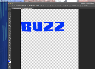
Buzz Logo:
The first thing i did was i downloaded a font from Dafont.com the font I choose was called Buzz saw. After i made the word as big and long as it needed to be i changed the colour to blue. I chose this font because i thought it would eye catching to the target audience.
 |
| Then i went into custom shapes tool on on Photoshop and put in the lighting bolt. I then re sized and rotated it till it was in the right spot. I added the lighting bolt because buzz is normally thought as electricity, as in electric buzz. |
 |
| Afterwards I used the custom shapes tool to create the line underneath the word buzz. After I did that I used the layer style tool to add an outer glow to the lighting bolt to make it more eye catching and to make it stand out. |
 |
I then added an inner glow to the word buzz in order for the word and shape to match up with each other and look like their part of the same shape of the logo. The inner glow was also part of the layer style tool I used for the outer glow on the lighting bolt.

 |
Lock Radio Logo:
 |
| For this logo i used the same font as i did on the previous logo, the font was called buzz saw from Dafont.com. Afterwards I typed lock as the radio station name, I then re sized the text and made it larger and wider, i did this until i had it as large as I needed it. |
 |
| I found an image of a key on Google images. I then cut in half using the lasso and eraser tools on Photoshop and removed the background using the magic wand tool. Once that was done i moved the key to the bottom of the K in lock. |
Afterwards i went on to Google images again and found a key hole image. I copied it on to Photoshop and drew a sentential of the key hole using the custom shape tool on Photoshop. Once i did that i drew in the new shape from the custom shape selection bar, I coloured it black and placed it over the O until i had it in the right spot.
After i did this i blended the key and the K together using the clone stamp tool and the eraser tools to blend and re shape the K and the key together as if they were apart of the same shape. Once I finished this I then added a yellow line using the rectangle in the custom shapes selection on Photoshop, i then coloured it yellow.
Pulse Radio Logo:
 |
| For the Pulse logo i used the same font as i did for the previous logos (which was called Buzz saw, that i found at Dafont.com) i used the same font with all three of these logos, so i make sure people knew they were connected with each other in terms of branding. |
|
 |
| I went onto Google and found an image of a pulse line and copied it onto Photoshop. After i did this i re-sized it till it was big enough when put next to the word on the screen, i also used the eraser tool to make the pulse line shorter, and tool remove part of the E to fit with the pulse line by turning the bottom of the E into a slope type shape. |
 |
| After i finished this i used the magic wand and colour filter tools on Photoshop change the colour of the pulse line. I did this so that the two objects could match up in colour. After all that i used the Photoshop layer style tool to added an outer glow to the pulse line, because pulse lines are known to be very bright in terms of colour. (The dotted line was from the magic wand tool i used to add this effect.) |
 |
| To match up the line and the word even further i added inner glow so the two shapes would sync up with other. I originally used an outer glow, but with the two large glows around everything made the logo look like an absolute mess. Anyway i added a rectangle line underneath the logo as i did with the previous logos so that each logo would look similar with each other but with differences in shapes, colour etc. |
 |
Finally i used the layer style Photoshop tool to added an inner glow to the line underneath the logo. I added this because the normal green along with the bright green made the line colour look flat and this would match up with the rest of the logo.
|


No comments:
Post a Comment